Nothing Community Contributions
2024
Stage 4: Marketing Campaign / Creative Treatment
Synopsis
Nothing is a London based tech company which focuses on making design and software centric products. In the year 2024, I participated in a series of competitions for the brand in which I designed an alternate version of their existing phone, a set of four wallpapers that would come pre-installed on it, the packaging box of the product and also directed the marketing campaign of said product. I shared my submissions on nothing.tech and nothing.community, the latter of which is the brand's official forum where other community members share their ideas as well. I noticed that it doesn't have an official app and so I decided to create a concept for that too. All of that has been documented here, if I make more such contributions I shall append them here.
Stage 1 : Hardware Design
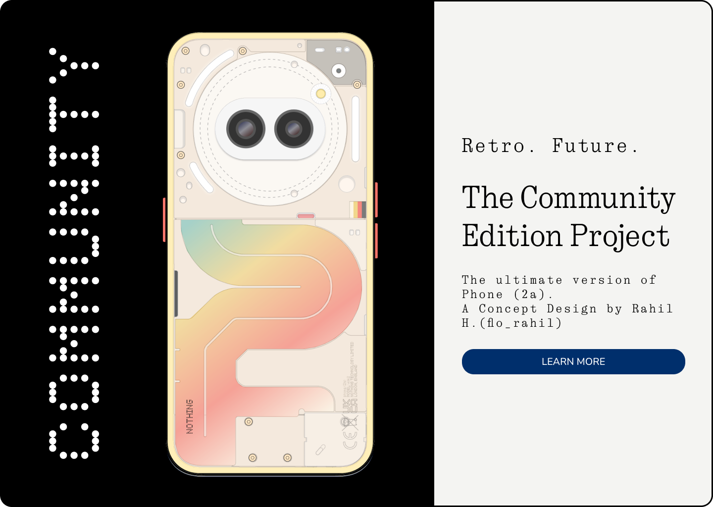
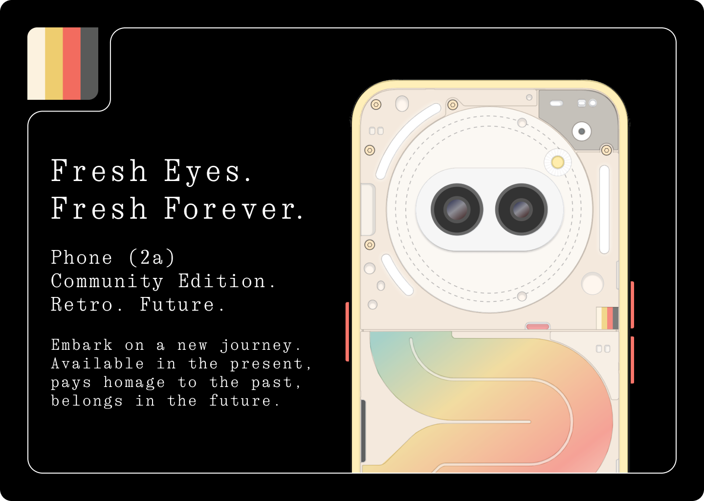
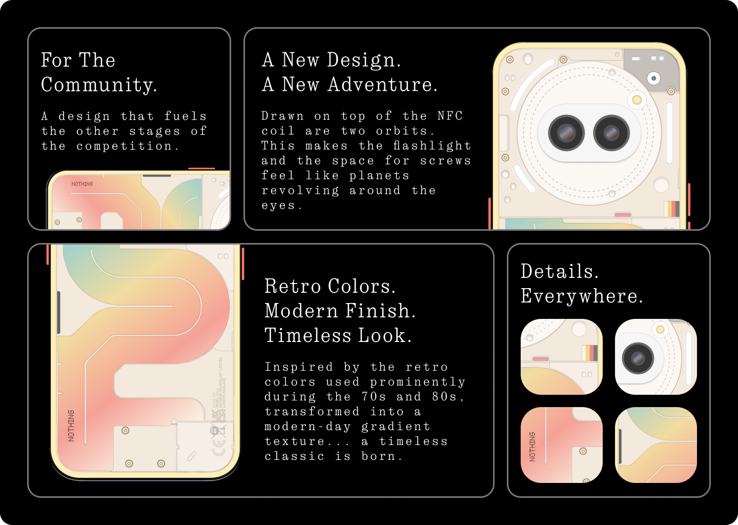
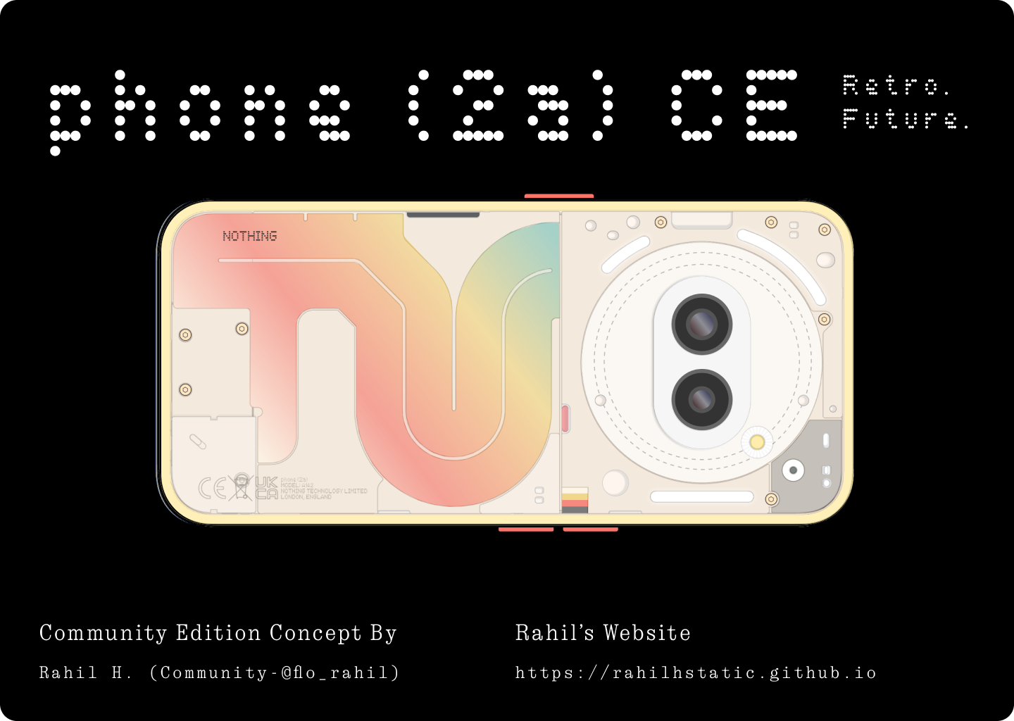
RETRO. FUTURE.
The entire design story behind this concept is that it pays homage to the past while belonging to the future. A truly timeless piece.
Phones today have limited shelf life specifications-wise, but design wise they can look like they belong to any era.
FRESH EYES. FRESH FOREVER.
Good design is meant to be timeless and to achieve that - is the intention here.
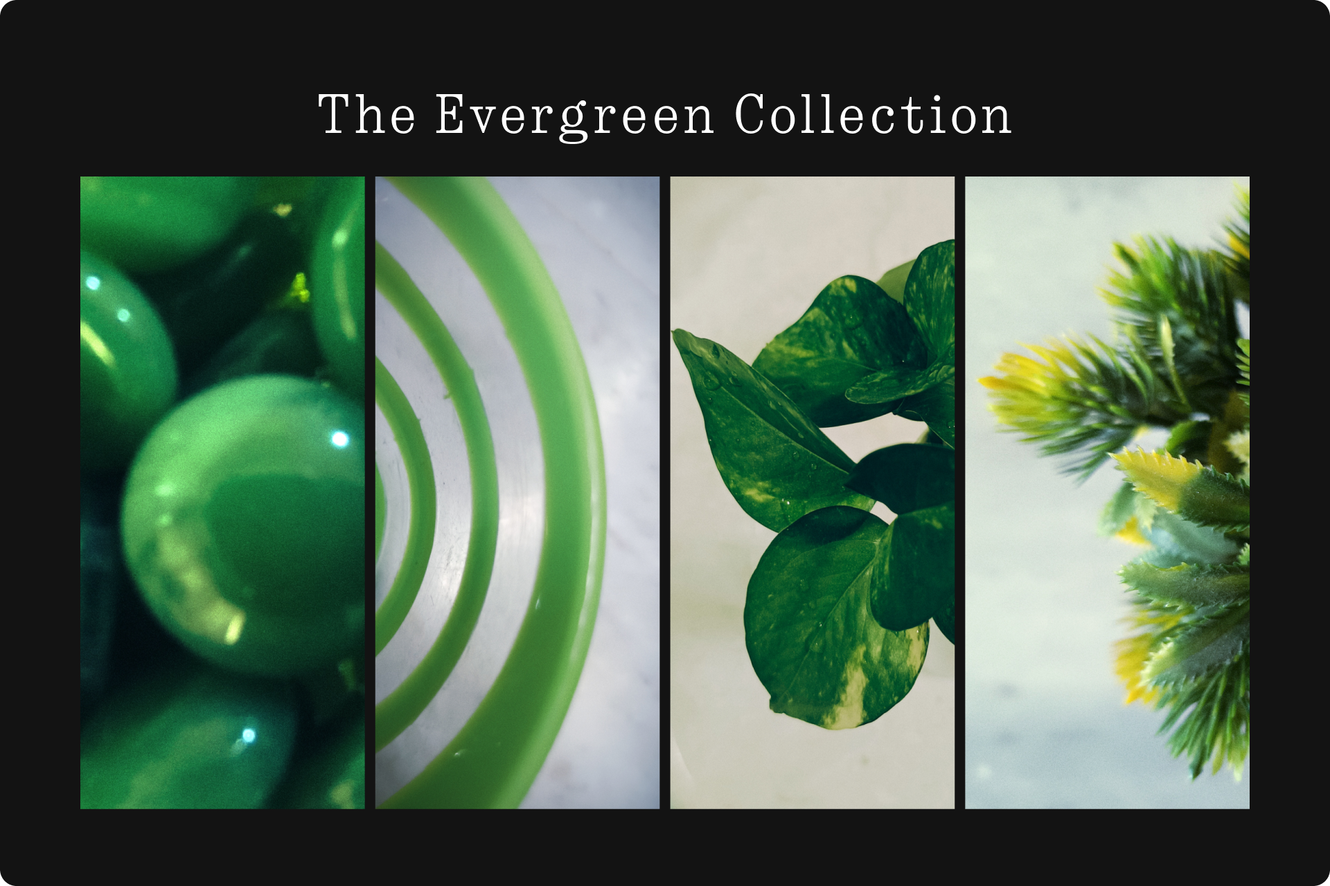
Stage 2 : Wallpaper Designs
EVERGREEN COLLECTION.
I curated a set of four wallpapers. These were pictures clicked from a camera and then edited in post. The full story behind them is explained
in the short video I made.
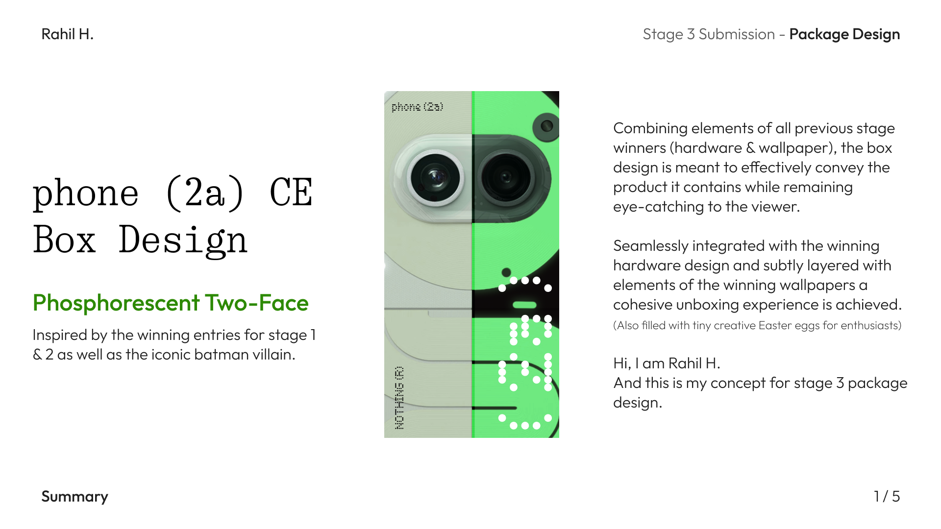
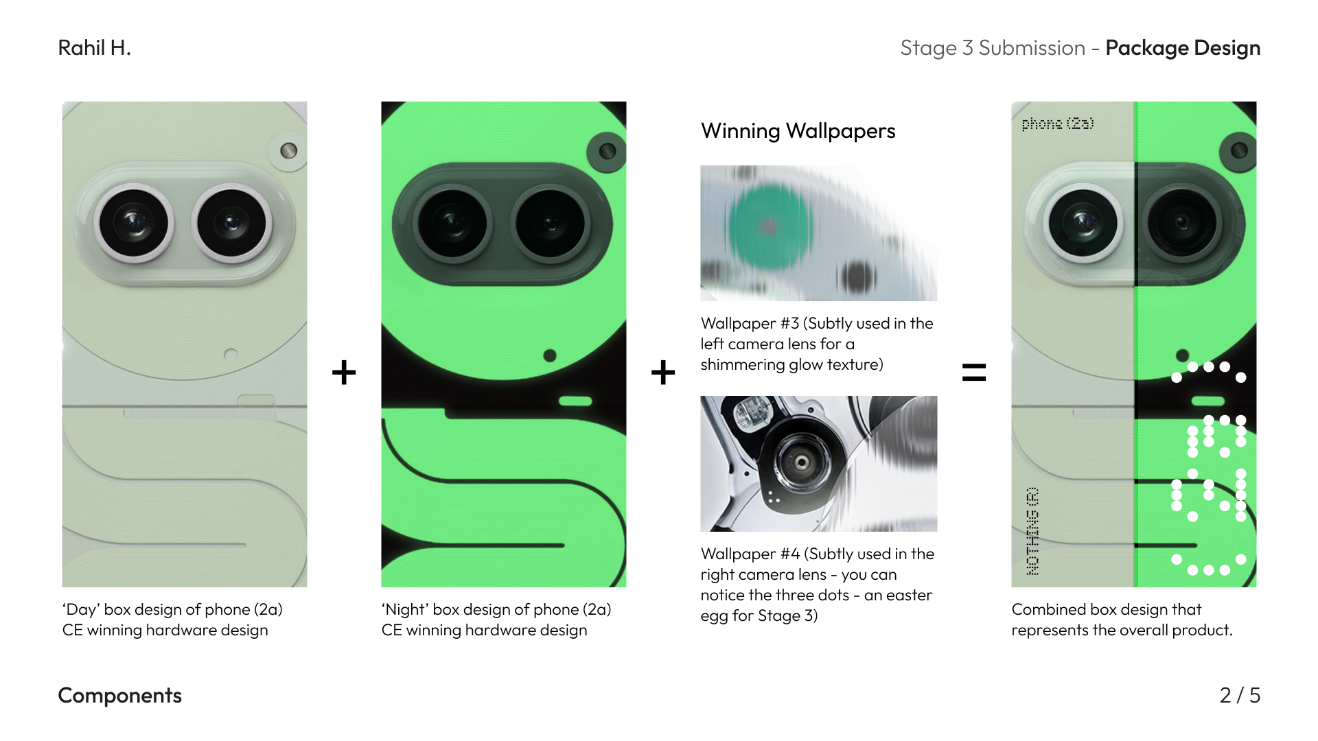
Stage 3 : Packaging Design
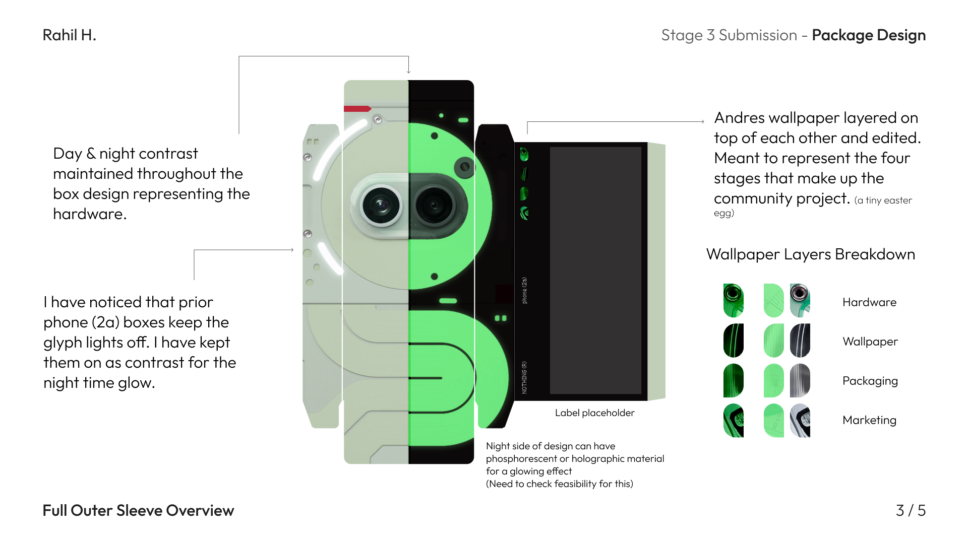
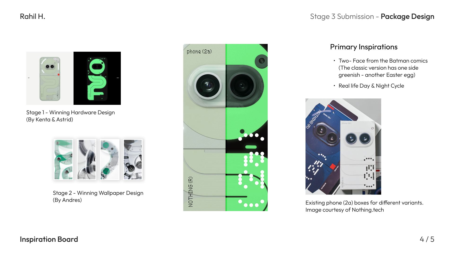
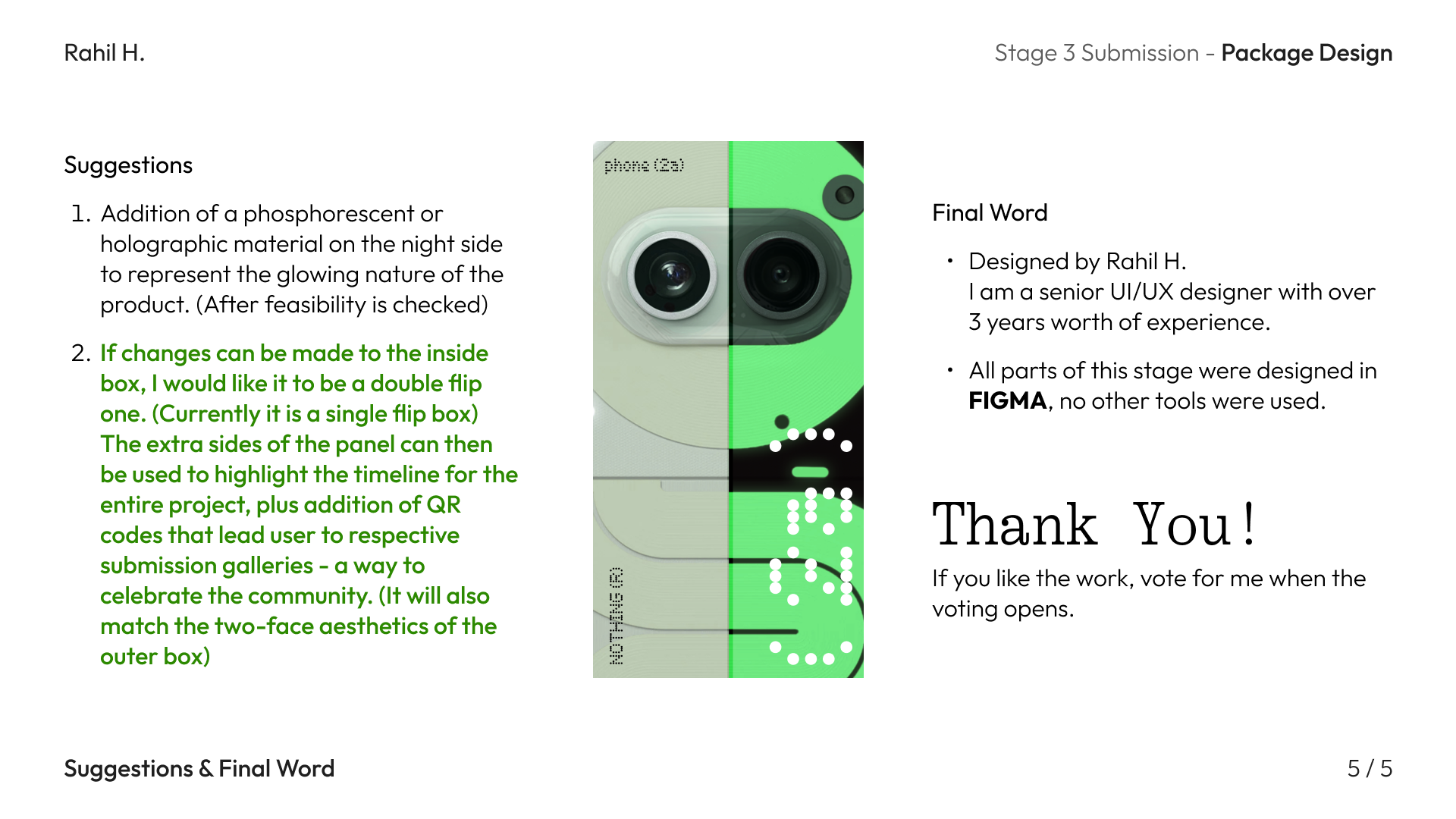
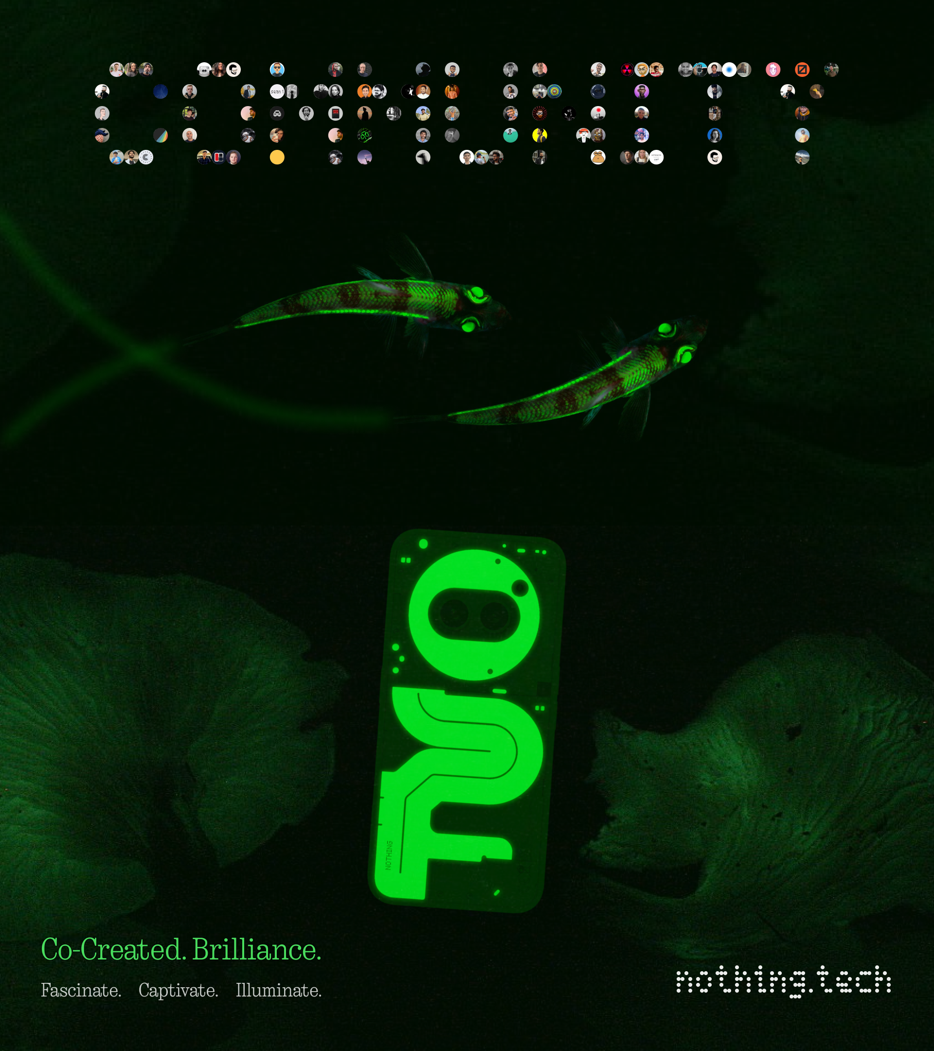
PHOSPHORESCENT TWO-FACE.
Inspired by the iconic batman villain.
Combining elements of all previous stage winners (hardware & wallpaper), the box design is meant to effectively convey the product it contains while remaining
eye-catching to the viewer. Seamlessly integrated with the winning hardware design and subtly layered with elements of the winning
wallpapers a cohesive unboxing experience is achieved. (Also filled with tiny creative Easter eggs for enthusiasts)
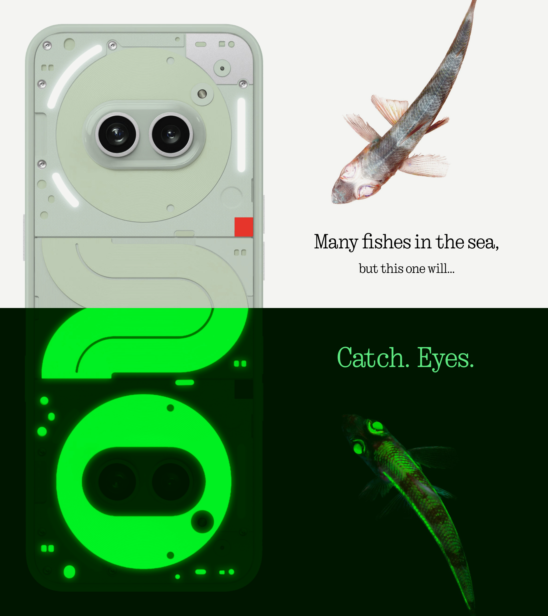
Stage 4: Marketing Campaign / Creative Treatment
Stage 4 was about the marketing campaign and creating a creative treatment for the same.
This was a detailed project in of itself.
Read the attached pdf to learn more and showcased below are the billboard ads I had designed for this campaign, along with the campaign tagline "Catch. Eyes."
Images used to describe the campaign concept are either in public domain or taken from wikipedia.
Download The Creative Treatment
Nothing Community App
Something I have seen a lot of people on the forum request for is the community app. So here is my concept for the same. For the first iteration (a set of four major screens) I have named them as version 1.0 - codenamed “Emma”. Further iterations will see changes/additions to these base four designs. As a result these are the foundations for this project.
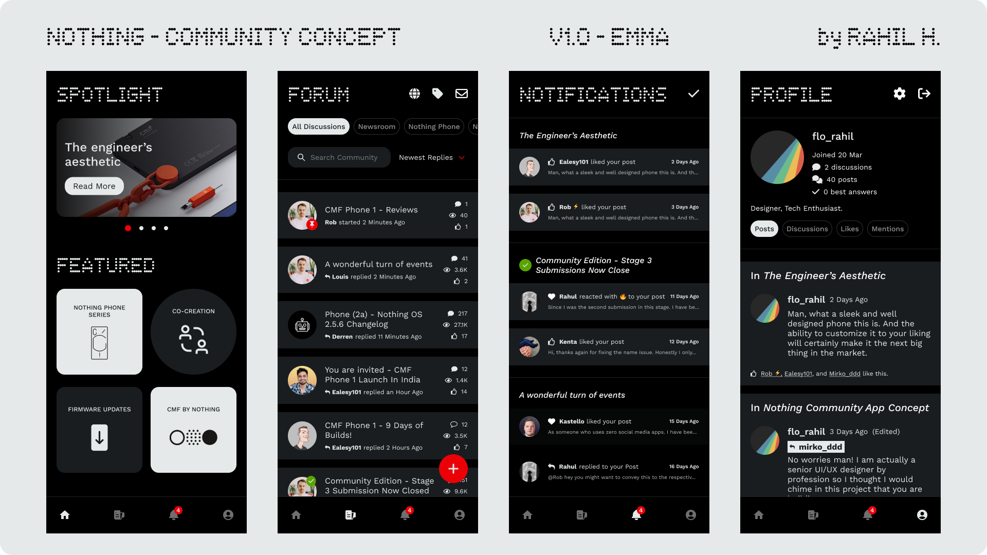
The app will comprise of “Home”, “Feed”, “Notifications”, “Profile” - as main items of navigation. Care has been taken to make sure all elements of the community forum are accommodated in these four.
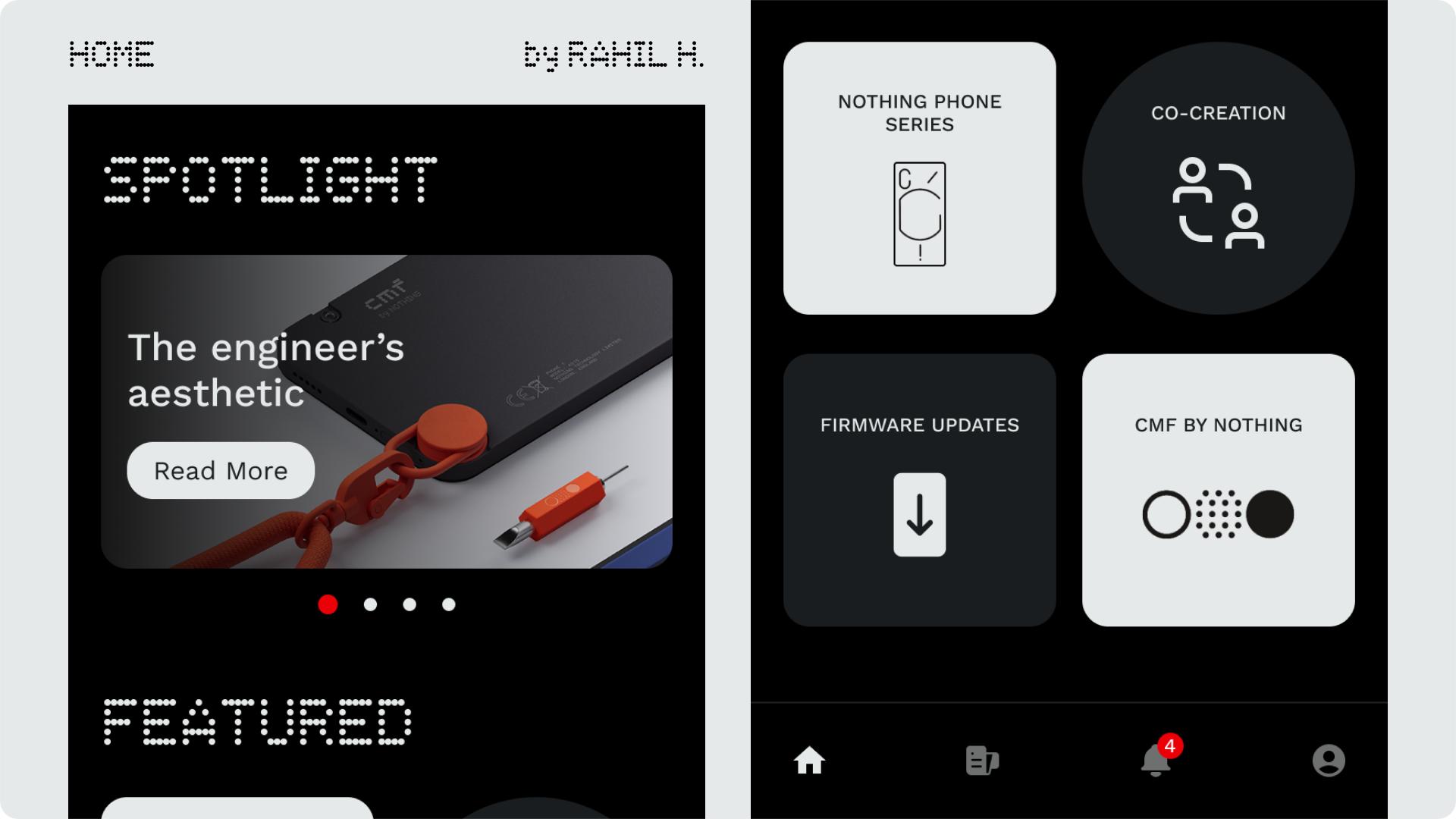
I have taken close inspiration from the aesthetics of the Nothing X and the Nothing Weather app so as to create a cohesive app ecosystem. The homepage contains quick links to respective tags in the forum. These 4 tags are of the utmost importance on the forum and the most visited, others can be accessed from the forum page.
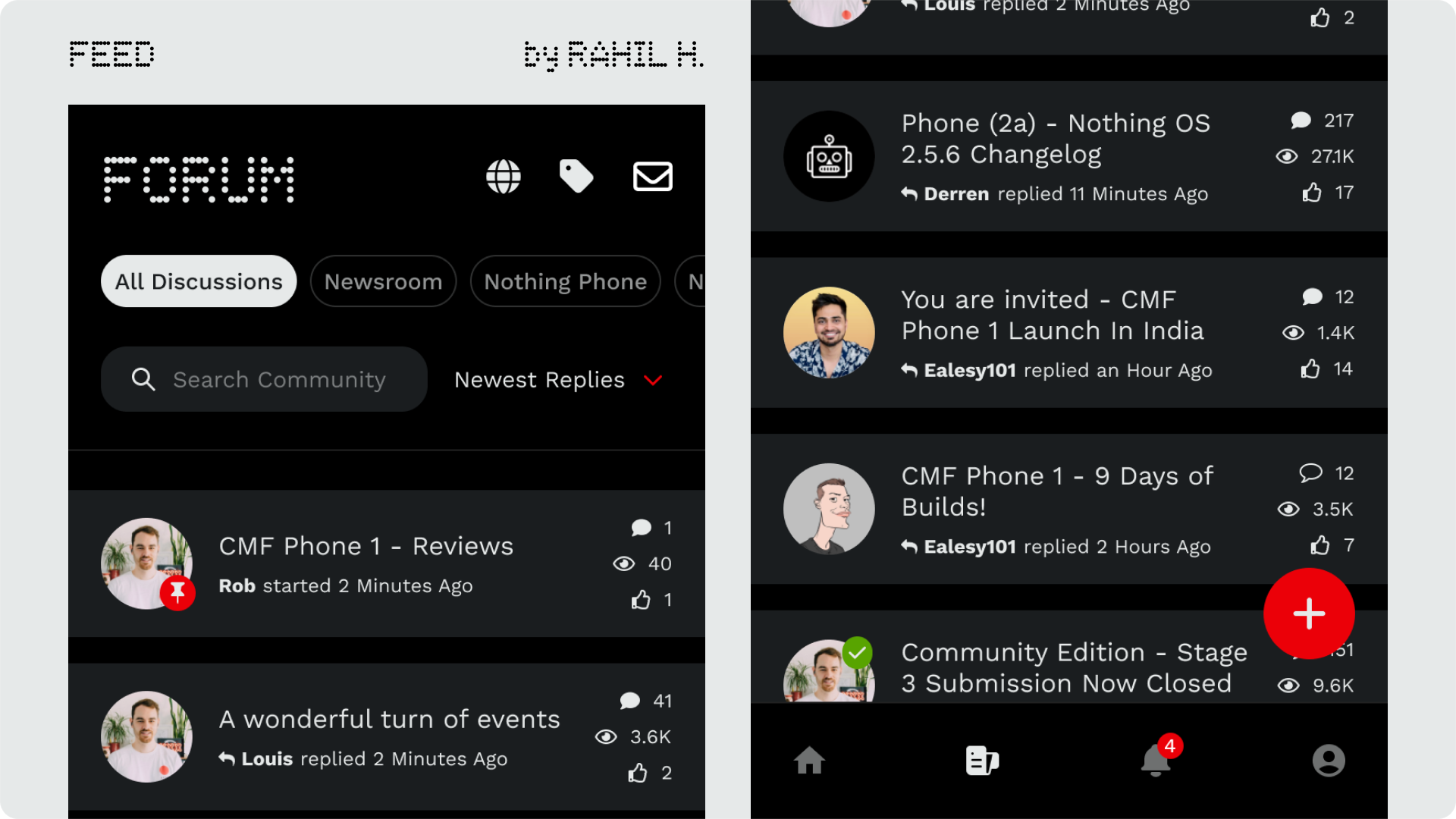
This is the news-feed,the actual heart of the forum. I have taken great care and noted all the little details that goes into making these type of feeds. Note how the posts that you are yet to read have a solid-fill comment icon and the ones that you have already read simply have an outline. Tags can be accessed
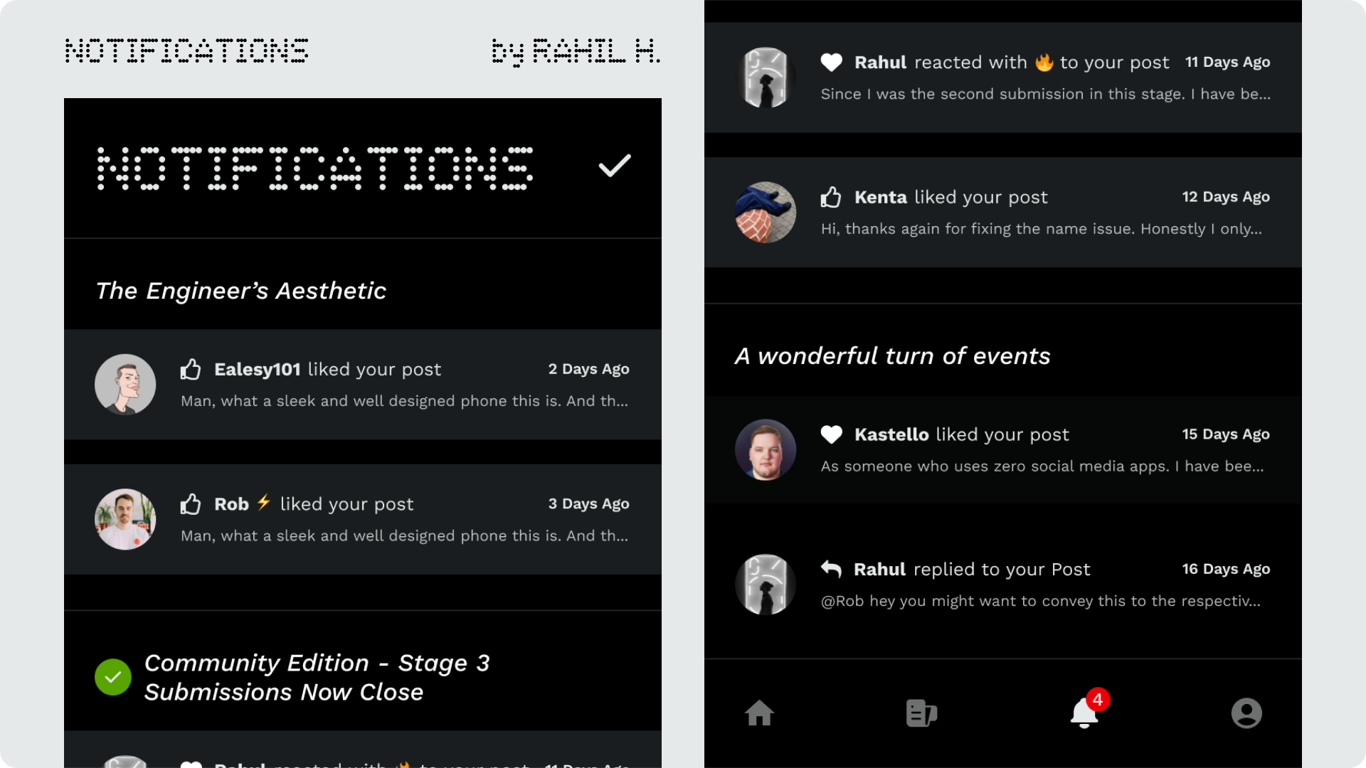
Some people might be against the idea of dedicating an entire section of the app to notifications. I debated against it too. But the heart and soul of the community app is obviously the community that interacts with one another. So a dedicated page is not only justified but also a need. Again a lot of care has been taken to make sure everything is communicated to the user without over complicating things.
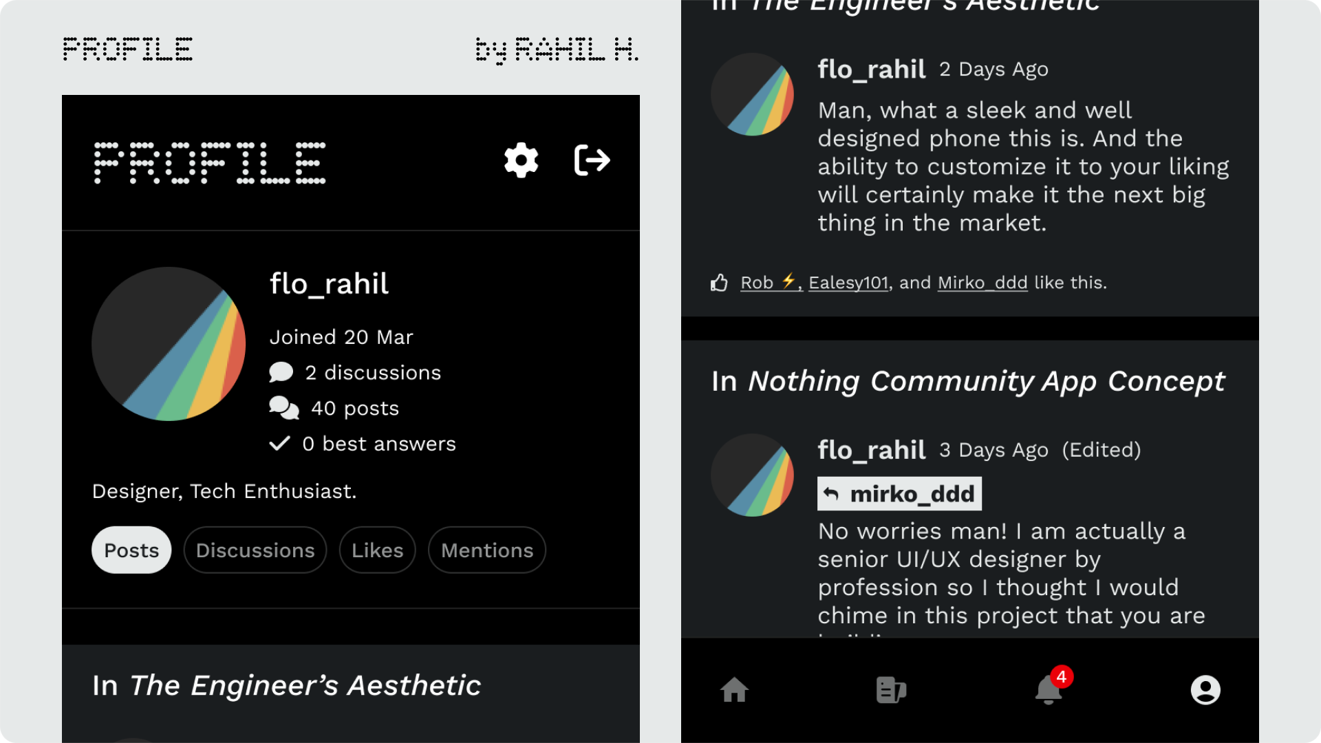
Finally the profile page. Meant to be a spot for the user to easily see all their posts, mentions, likes and discussions.
The settings icon on top will open the profile settings. (I will elaborate on those screens in V2.0) You also have the logout button here.
My concept of the app was quite well received by the community members, it was even showcased on their socials and the community manager even highlighted how my spotlight page needs to be an official addition.
Note : NOTHING's logo, its font, the actual phone design of 2a and certain promotional photos are all properties of NOTHING. I simply retain a license to showcase my work.