
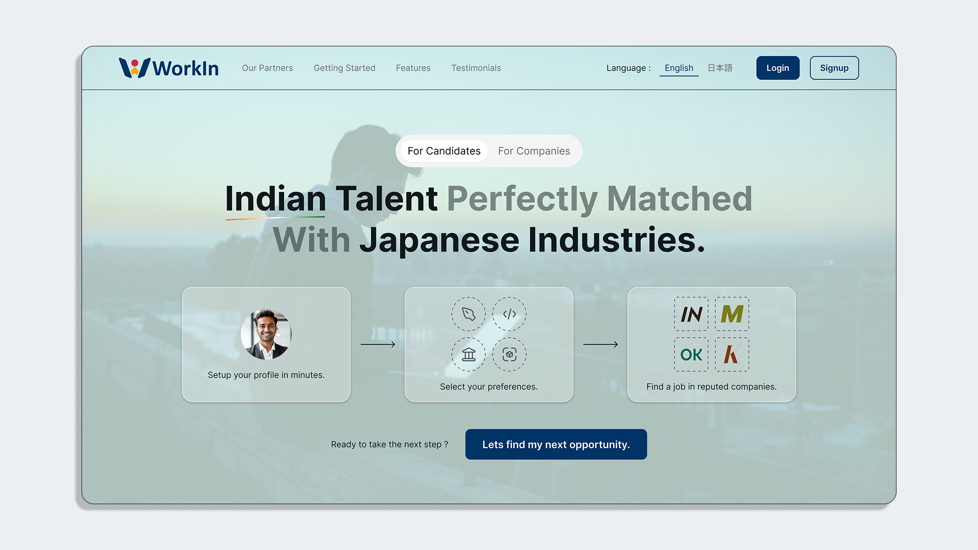
WorkIn
UI/UX, Web & App Design
Synopsis
WorkIn is a partnership project between Nextplatforms, local colleges/agencies and various companies based in Japan.
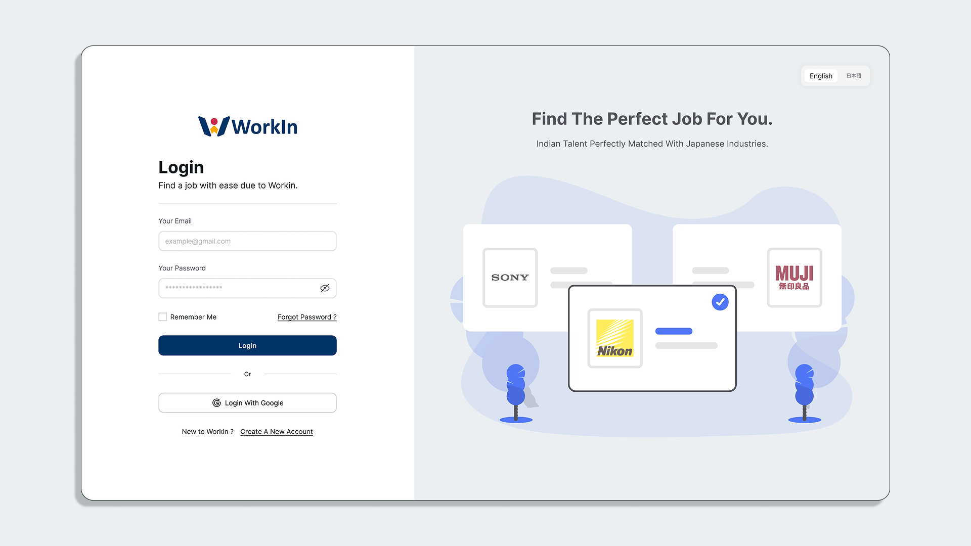
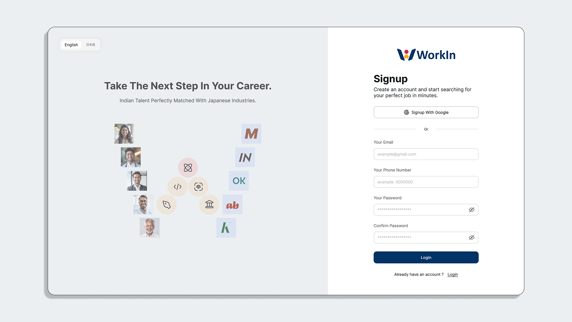
The basic aim of this project was to give Indian talents a platform to apply for opportunities in Japan. Anyone can sign-up and apply.
These talent can also be hired while in college for internship opportunities, etc.
There is a slightly different user flow for candidates going through their respective institutes.
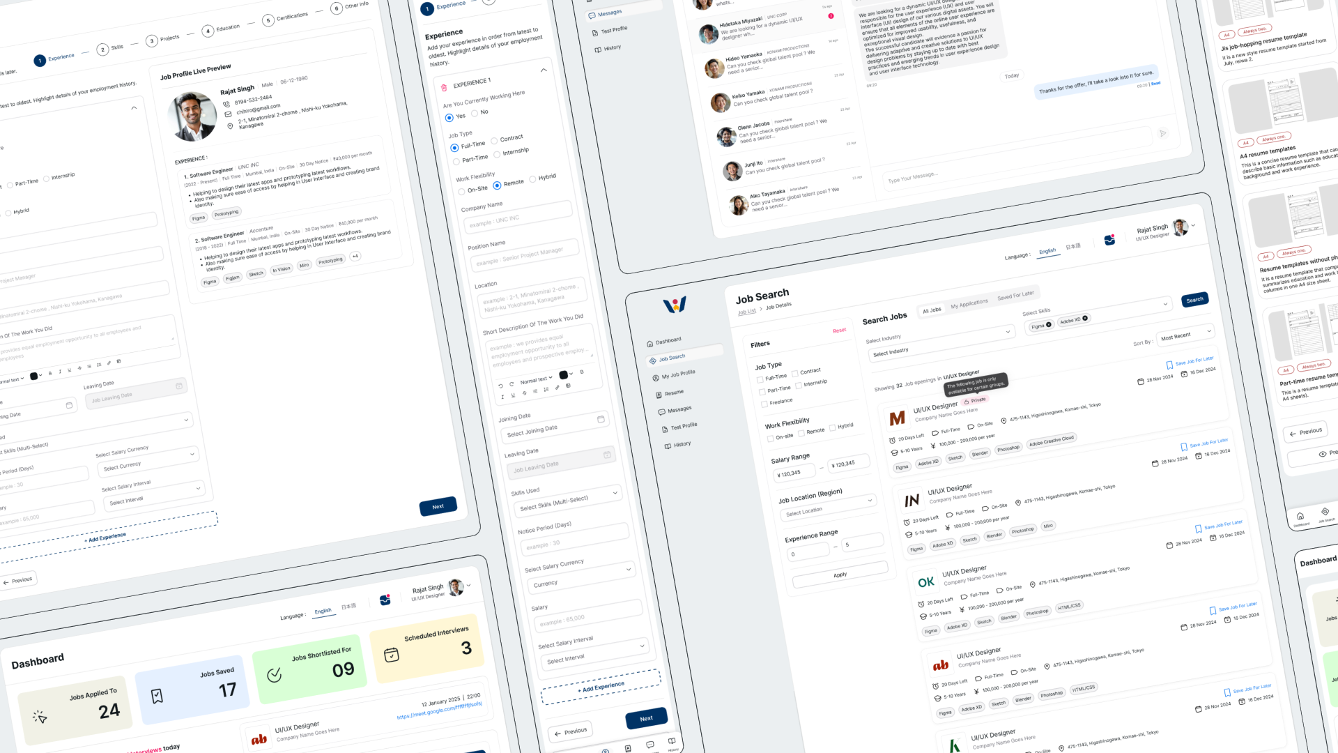
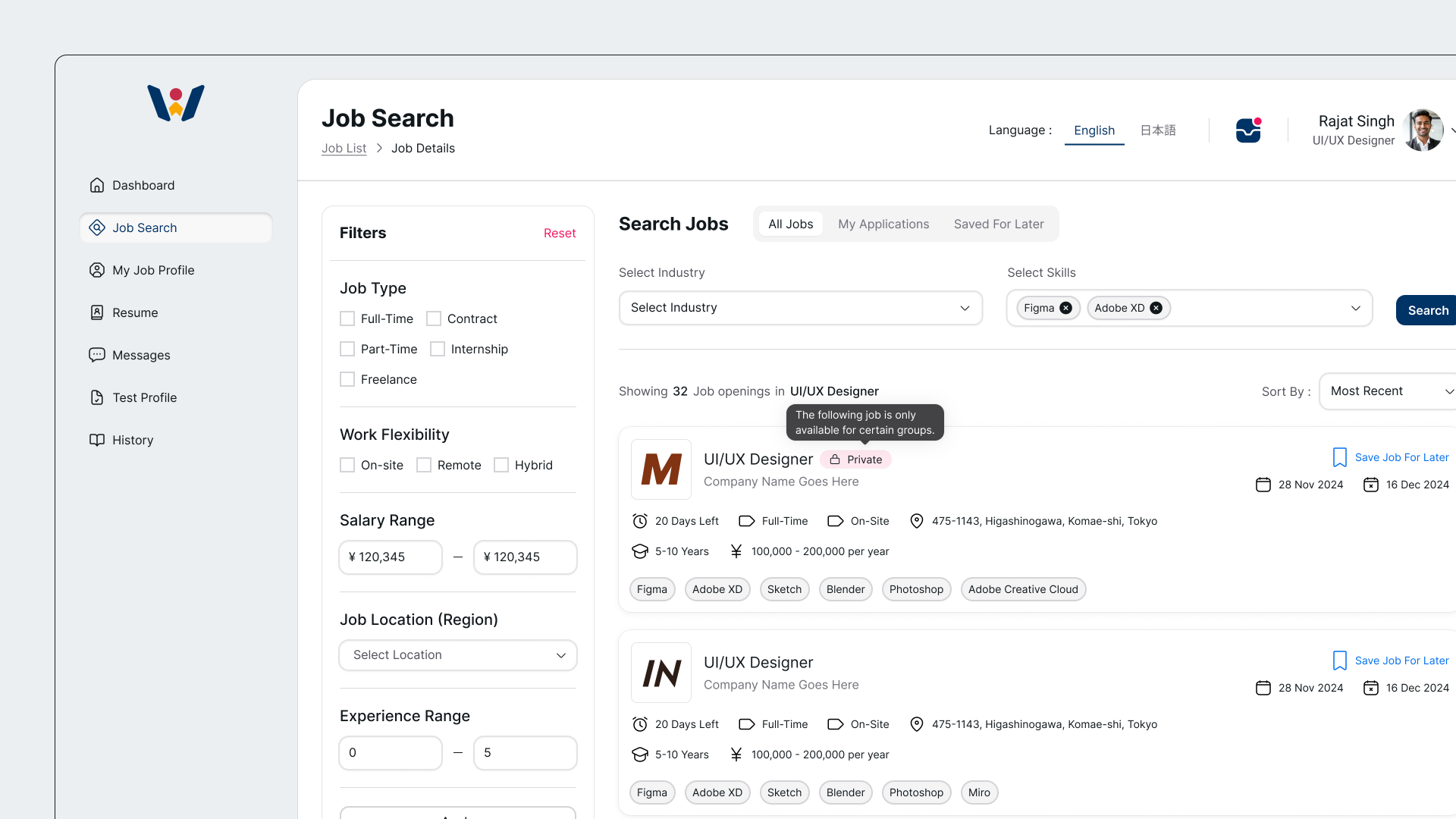
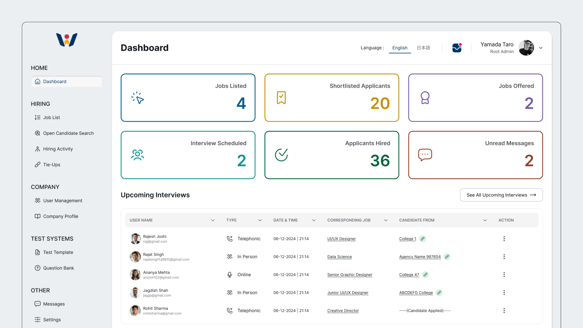
The user side also has an inbuilt resume builder.
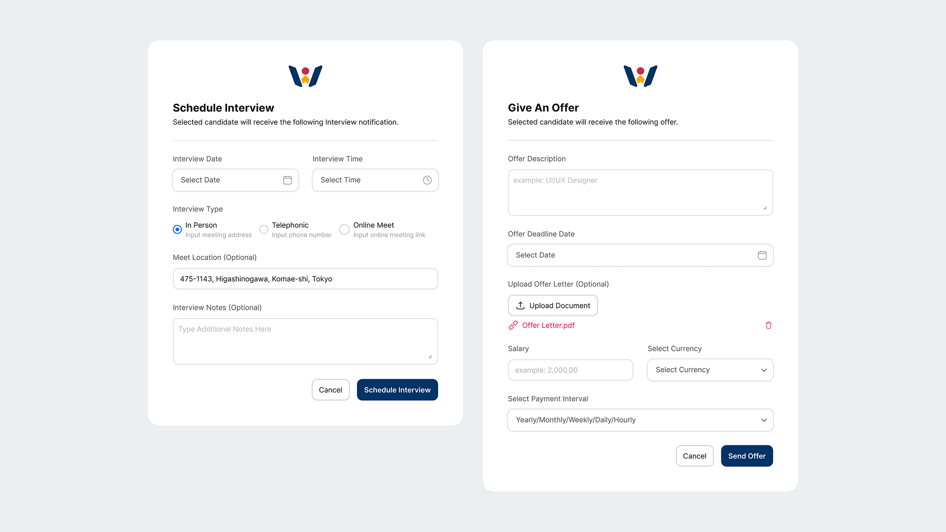
On the other end of the spectrum, the app is also a portal for companies to create their profile, post job openings and evaluation tests for potential talent.
As a result the app also has a built-in question bank and exam creation tool.
These companies can connect with colleges/agencies and exclusively post jobs for them that will be hidden from other general users.
Agencies also have there own separate login where they can onboard individual candidates and apply for jobs on their behalf.
They also have the ability to create evaluation tests for them.
I designed all three parts of this project, along with the official Workin website, with responsiveness in mind.
The design got iterated on heavily as there were multiple additional requirements from all parties.
The app was tested locally in India and pitched to regional colleges and companies.
Challenges & Approach
From the above brief, its easy to understand that this is a complex and deeply layered web application.
An in-built resume builder and online test creator itself would be giant undertaking as standalone products, but combining them
with a job search and management environment as its central focus makes them quite complicated.
Designing an app from three different perspectives, each having their own set of requirements is also a challenge.
Not just that, but we had a tight deadline too. Designs were getting converted into the product in real time.
The starting step is to create a user flow, but even this is not 100% reliable as additional requirements continue to pour in.
The initial feature list was drastically different from the final version, as a result there was a lot of uncertainty while designing the app.
I purposely designed everything with modularity in mind, fully aware that modifications to existing screens were always a possibility.
That is precisely why everything is grouped into cards.
Clear and direct communication with all parties involved is a necessity.
Keeping the developers updated with any changes made to the designs is also equally important.
Gallery


Note : Logos &/or mentions of Japanese brands, Indian colleges or names of individuals are used just for conceptual/fictional purposes and many are dummy values meant to fill space. These entities are not affiliated with the project in any capacity.